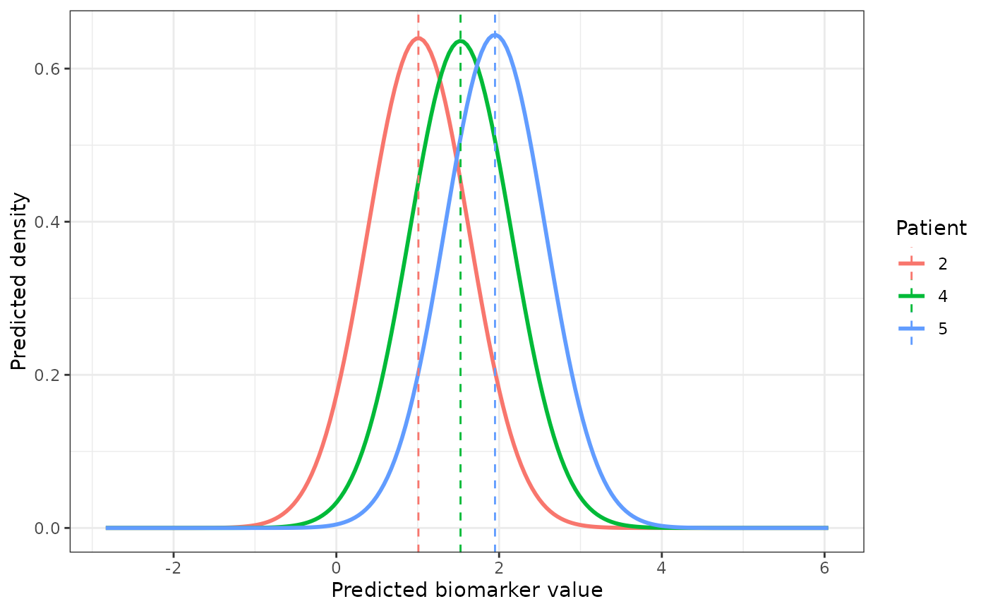
Plots the predicted distribution of the biomarker at
prediction_time + horizon returned by predictLongitudinal,
one curve per patient, with a dashed line at the patient's point
prediction (the most likely value, Y_predict). For an ordinal
biomarker, plots each patient's predicted category probabilities as bars
instead.
Usage
# S3 method for class 'predictLongitudinal.BJM'
plot(x, subject = NULL, ...)
Arguments
- x
A
predictLongitudinal.BJMobject, i.e. the result ofpredictLongitudinal()for a single biomarker. For several biomarkers, plot one element of the returned list, e.g.plot(result[["serBilir"]]).- subject
Patients to plot, as ids (the names of
x$Y_predict) or positions.NULL(default) plots every patient, or the first six when there are more.- ...
Currently unused.
Examples
# \donttest{
data(pbc3)
survival_fit_all <- survivalSub(pbc3[!duplicated(pbc3$id), ],
Surv(years, status3) ~ age + sex, NULL)
long_sub_fixed <- list("long1" = serBilir ~ year + age + sex + years)
long_sub_random <- list("long1" = ~ year | id)
long_fit_all <- longitudinalSub(list(pbc3[pbc3$status3 == 1, ]),
long_sub_fixed, long_sub_random)
data_predict <- pbc3[pbc3$id %in% c(2, 4, 5) & pbc3$year <= 3, ]
data_predict$years <- NA
trans <- survivalTrans(c(1, 3, 5, 7))
pred <- predictLongitudinal(data_predict, long_fit_all, survival_fit_all,
prediction_time = 3, horizon = 1, time_variable = "year",
trans$survival_variable_all, trans$survival_trans_function, bio_i = 1)
plot(pred)
 # }
# }